

Mathematics, 24.06.2021 22:00, jadenwilsan
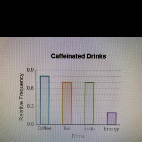
The bar graph below displays students' responses to
the question "What caffeinated drinks do you
consume?"
Would it be appropriate to display the data with a pie
chart?
Yes, because the data are grouped into categories.
Yes, because the data can be represented by a
relative frequency compared to the whole.
No, because the data add up to more than 100%.
No, because the data categories are too broad.

Answers: 3


Other questions on the subject: Mathematics
Mathematics, 21.06.2019 18:00, ineedhelp2285
Yesterday i ran 5 miles. today, i ran 3.7 miles. did my percent increase, decrease or is it a percent error? plz i need
Answers: 2
Mathematics, 21.06.2019 19:00, Goldenstate32
Gh bisects fgi. find the measure of hgi •15° •21° •10° •8°
Answers: 2
Do you know the correct answer?
The bar graph below displays students' responses to
the question "What caffeinated drinks do you
Questions in other subjects:

Mathematics, 10.12.2020 17:00


English, 10.12.2020 17:00


