

Mathematics, 26.04.2021 23:30, marxusalexander4069
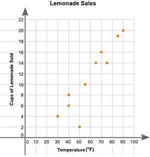
Eric plotted the graph below to show the relationship between the temperature of his city and the number of cups of lemonade he sold daily:
A scatter plot is shown with the title Lemonade Sales. The x-axis is labeled High Temperature, and the y-axis is labeled Cups of Lemonade Sold. Data points are located at 30 and 4, 40 and 6, 40 and 8, 50 and 2, 55 and 10, 65 and 14, 70 and 16, 75 and 14, 85 and 19, 90 and 20.
Part A: Describe the relationship between the temperature of the city and the number of cups of lemonade sold. (2 points)
Part B: Describe how you can make the line of best fit. Write the approximate slope and y-intercept of the line of best fit. Show your work, including the points that you use to calculate the slope and y-intercept. (3 points)

Answers: 3


Other questions on the subject: Mathematics
Mathematics, 21.06.2019 17:30, sarinawhitaker
25 ! the line of best fit is h = 5a + 86. predict the height at age 16. show your work.
Answers: 1
Mathematics, 21.06.2019 23:40, dontcareanyonemo
The function f(x) is shown in this graph the function g(x)=6x
Answers: 2
Mathematics, 22.06.2019 03:00, justin5647
Luigi is the first person to finish a 5k race and is standing 13 feet beyond the finish line. another runner, mario, is still running the race and has approximately 24 feet before he reaches the finish line. what is the distance between mario and luigi? explain through words, numbers or pictures how you found the answer.
Answers: 1
Do you know the correct answer?
Eric plotted the graph below to show the relationship between the temperature of his city and the nu...
Questions in other subjects:


