

Mathematics, 14.01.2021 09:30, autumnsusan190ox9kn4
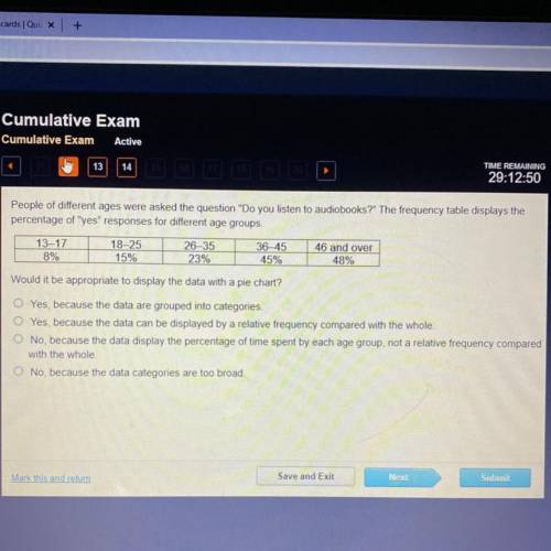
People of different ages were asked the question "Do you listen to audiobooks?" The frequency table displays the
percentage of "yes" responses for different age groups
13-17
8%
18-25
15%
26-35
23%
36-45
45%
46 and over
48%
Would it be appropriate to display the data with a pie chart?
O Yes, because the data are grouped into categories
O Yes, because the data can be displayed by a relative frequency compared with the whole
O No, because the data display the percentage of time spent by each age group, not a relative frequency compared
with the whole
O No, because the data categories are too broad
Save and Exit
Next
Submit
art this and rem

Answers: 2


Other questions on the subject: Mathematics
Mathematics, 21.06.2019 14:00, deadslinger5134
Which product is positive a is 2/5 -8/9 -1/3 -2/7 b is -2/5 8/9 -1/3 -2/7 c is 2/5 8/9 1/3 -2/7 d is -2/5 -8/9 1/3 2/7
Answers: 2
Mathematics, 22.06.2019 00:30, mercydiaz84
Measure a and b and find their sum. how are the angles related?
Answers: 3
Mathematics, 22.06.2019 01:20, lillyd2873
The first week samantha learned to read braille, she could read 10 words per minute. in the second week she increased her speed by 20%. in the third week she increased her speed again by another 25%. how many words could she read per minute by the third week? hurry and tell me!
Answers: 1
Do you know the correct answer?
People of different ages were asked the question "Do you listen to audiobooks?" The frequency table...
Questions in other subjects:


