

Mathematics, 16.12.2020 21:20, kevo2024
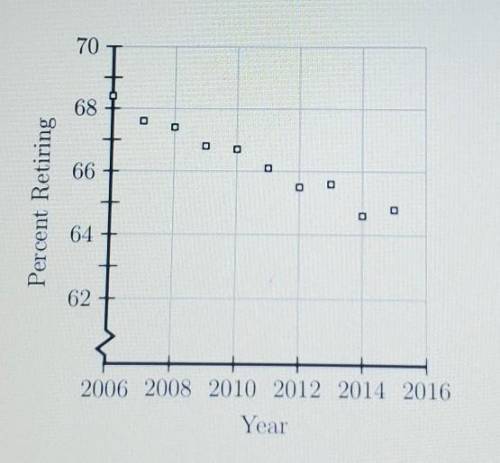
The scatterplot shown below represents data for each of the years from 2006 to 2015. The plot shows the percent of people 62 years of age and older who were working and then retired during each of those years. If this trend continued which of the following best predicts the percent who retired in 2016?
A.) 62%
B.) 64%
C.) 66%
D.) 68%

Answers: 2


Other questions on the subject: Mathematics
Mathematics, 21.06.2019 17:30, leslcookie23
During a bike challenge riders have to collect various colored ribbons each 1/2 mile they collect a red ribbon each eighth mile they collect a green ribbon and each quarter mile they collect a blue ribbion wich colors of ribion will be collected at the 3/4 markrer
Answers: 3
Mathematics, 21.06.2019 18:30, edwinadidas9938
The border line of the linear inequality 4x + 7y < 5 is dotted true or false?
Answers: 2
Do you know the correct answer?
The scatterplot shown below represents data for each of the years from 2006 to 2015. The plot shows...
Questions in other subjects:

Mathematics, 26.02.2021 22:50

Mathematics, 26.02.2021 22:50


Physics, 26.02.2021 22:50


