

Mathematics, 22.10.2020 21:01, vero5047
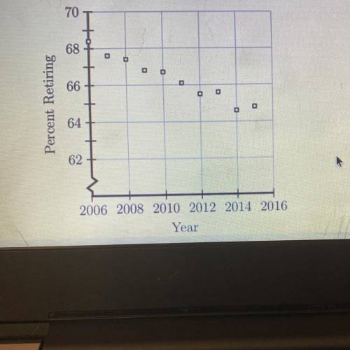
The scatterplot shown below represents data for each of the years from 2006
to 2015. The plot shows the percent of people 62 years of age and older who
were working and then retired during each of those years. If this trend continued
which of the following best predicts the percent who retired in 2016?

Answers: 2


Other questions on the subject: Mathematics
Mathematics, 21.06.2019 21:00, Liantic8738
Oliver read for 450 minutes this month his goal was to read for 10% more minutes next month if all of her medicine go how many minutes will you read all during the next two months
Answers: 3
Do you know the correct answer?
The scatterplot shown below represents data for each of the years from 2006
to 2015. The plot shows...
Questions in other subjects:

Health, 25.10.2019 16:43

Mathematics, 25.10.2019 16:43
Mathematics, 25.10.2019 16:43

Biology, 25.10.2019 16:43

History, 25.10.2019 16:43


