


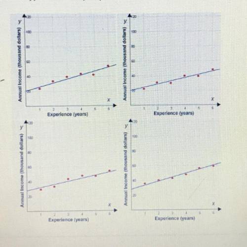
Select the correct graph.
When David first got a job, his annual income was $20,000. He worked...

Mathematics, 24.05.2020 10:57, Gabriella0000
Select the correct graph.
When David first got a job, his annual income was $20,000. He worked hard and got more experience. After 8 years, he realized that his average
increase in pay was about $4,000 every year. Which scatter plot represents this situation?
I need help which graph is it?

Answers: 1
Other questions on the subject: Mathematics
Mathematics, 21.06.2019 18:00, officialgraciela67
Which shows the correct lengths of side c in both scales? scale 1: 45 m; scale 2: 60 m scale 1: 60 m; scale 2: 45 m scale 1: 36 m; scale 2: 27 m scale 1: 27 m; scale 2: 36 m mark this and return save and exit
Answers: 3
Do you know the correct answer?
Questions in other subjects:
Mathematics, 14.01.2021 06:40
Mathematics, 14.01.2021 06:40
Mathematics, 14.01.2021 06:40

History, 14.01.2021 06:40

Spanish, 14.01.2021 06:40

Computers and Technology, 14.01.2021 06:40

Mathematics, 14.01.2021 06:40


