
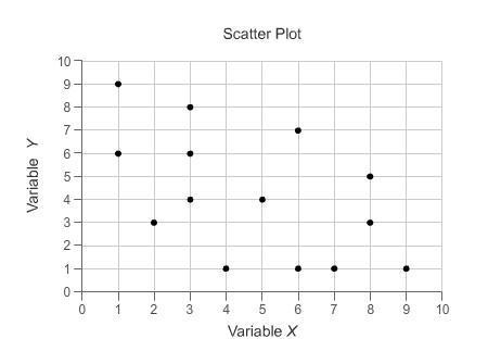


Which describes the correlation shown in the scatterplot?
On a graph, points are grouped...

Mathematics, 08.04.2020 22:16, only1cache
Which describes the correlation shown in the scatterplot?
On a graph, points are grouped together and decrease.
There is a positive correlation in the data set.
There is a negative correlation in the data set.
There is no correlation in the data set.
More points are needed to determine the correlation.

Answers: 3
Other questions on the subject: Mathematics
Mathematics, 21.06.2019 22:00, stalley1521
How many solutions does the nonlinear system of equations graphed below have? a. one b. zero c. four d. two
Answers: 2
Mathematics, 22.06.2019 00:00, Satoetoe24
The cost of a taxi ride includes an initial charge of $2.00. if a 5km ride cost $6.00 and a 10km ride cost $10.00, determine the cost of a 15km ride.
Answers: 1
Mathematics, 22.06.2019 04:40, anhekb
The accompanying normal probability plot was constructed from a sample of 30 readings on tension for mesh screens behind the surface of video display tubes used in computer monitors. does it appear plausible that the tension distribution is normal? the given probability is has a significant downward curve, so it is plausible that the tension distribution is normal. the given probability is has a significant downward curve, so it is not plausible that the tension distribution is normal. the given probability is quite linear, so it is plausible that the tension distribution is normal. the given probability is has a significant upward curve, so it is not plausible that the tension distribution is normal. the given probability is quite linear, so it is not plausible that the tension distribution is normal.
Answers: 1
Do you know the correct answer?
Questions in other subjects:

Social Studies, 11.10.2019 19:30

Social Studies, 11.10.2019 19:30


English, 11.10.2019 19:30

Mathematics, 11.10.2019 19:30


