

Mathematics, 09.02.2020 18:20, KhaliylTestman
You have learned about scatter plots and how they can be used to show the relationship between two events. In this project we will learn about residual plots and how they can be used to determine whether assumptions made from the linear regression analysis are valid. Many important questions can be answered by statistical analysis. For example, does the number of hours spent sleeping affect the score of a standardized test?
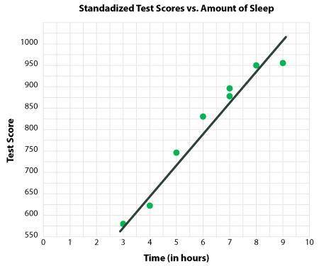
Let’s take a look at the data collected:
Time
(in hours) Standardized Test Score
4 620
6 830
8 950
7 890
7 870
3 580
9 960
5 740
The graph shows the data and the regression line, also known as line of best fit, which best fits the data. There appears to be a positive correlation between the number of hours slept and the score on the test. We see there are errors in the prediction, known as the residuals.
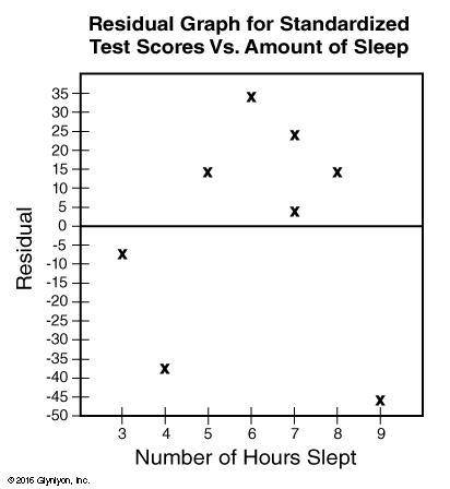
A residual plot is a scatter plot that has the residuals on the vertical axis and the independent variable on the horizontal axis. Residual plots can be used to assess whether linear regression is appropriate for the data set.
Residuals are found by subtracting the observed value and the predicted value.
Hours Sleeping(x) Observed Value Predicted Value Residual (y)
4 620 657 -37
6 830 796 34
8 950 936 14
7 890 866 24
7 870 866 4
3 580 587 -7
9 960 1006 -46
5 740 726 14
Now we can make a residual plot using the hours as our x-values in the horizontal axis and the residual as our y-values in the vertical axis.
As you can see, the scatter plot has a relatively random pattern, which indicates a linear relationship between the dependent and independent variables. This means that linear regression is appropriate for the data analysis.
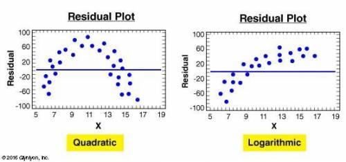
Below are some examples of non-random patterns that show that the relationship between the dependent and independent variable is non-linear.
Note that any plot, not just the examples above, that show some sort of pattern would be considered non-random.
Different patterns would result in different assumptions of the data. If your residual plot has a linear pattern, then your data is likely biased due to a variable that was not included in the experiment. For example, if you were to look at the relationship between BMI and hours spent in a gym, but didn’t consider age as a factor. If your residual plot shows a quadratic pattern like the one above, your data is also likely biased because of a non-linear relationship; for example, the relationship between age and height.
When a non-random plot occurs, we can say that it is inappropriate to fit a line and we should use some other function instead.
YOUR TASK:
Design a question that asks about the relationship between two events, like the one in the example above, that can be supported by data.
Collect a minimum of 10 data points; you may use the web to collect this data. For example, you can use a website such as www. surveymonkey. com to create a survey to conduct the research.
Construct a scatter plot of the data including the regression line as well as a residual plot. You may use www. meta-calculator. com to construct the scatter plots by using the graphing calculator and inserting the points in the “table” tab.
Draw conclusion(s) from both of the plots you made and assess whether the residual plot indicates a linear or non-linear model. Your conclusion(s) should include a discussion of the relationship of the two variables. Provide an explanation for your conclusion(s).
1. Submit your question that asks about the relationship between two events that can be supported by data.
2. Upload your dataset and scatterplot. Be sure to include a regression line and residual plot.
3. Draw conclusion(s) from both of the plots you made and assess whether the residual plot indicates a linear or non-linear model. Your conclusion(s) should include a discussion of the relationship of the two variables. Provide an explanation for your conclusion(s).

Answers: 2


Other questions on the subject: Mathematics
Mathematics, 21.06.2019 17:30, leannamat2106
43lbs of tomatos cost $387. how much would 41lbs cost
Answers: 1
Mathematics, 21.06.2019 20:30, strawberrymochi390
What is the axis of symmetry of the function f(x)=-(x+ 9)(x-21)
Answers: 2
Mathematics, 21.06.2019 21:00, arizmendiivan713
*let m∠cob = 50°30’, m∠aob = 70° and m∠aoc = 20°30’. could point c be in the interior of ∠aob? why?
Answers: 1
Do you know the correct answer?
You have learned about scatter plots and how they can be used to show the relationship between two e...
Questions in other subjects:
Mathematics, 23.07.2021 16:30
Mathematics, 23.07.2021 16:30


Physics, 23.07.2021 16:30
Mathematics, 23.07.2021 16:30
Mathematics, 23.07.2021 16:40


