


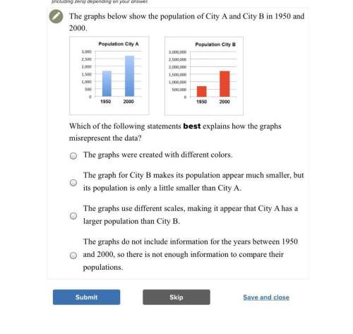
Which of the following statements best explains how the graphs misrepresent the data?
a...

Mathematics, 26.01.2020 07:31, Katelynn7086
Which of the following statements best explains how the graphs misrepresent the data?
a. the graphs were created with different colors.
b. the graph for city b makes its population appear much smaller, but its population is only a little smaller than city a.
c. the graphs use different scales, making it appear that city a has a larger population than city b.
d. the graphs do not include information for the years between 1950 and 2000, so there is not enough information to compare their populations.

Answers: 1
Other questions on the subject: Mathematics
Mathematics, 22.06.2019 00:40, williamlindley2
The length of the line segment ac is 8x-9 what is the value of x
Answers: 2
Mathematics, 22.06.2019 01:00, mimithurmond03
Find the unit rate. enter your answer as a mixed number. a fertilizer covers 2/3 square foot in 1/2 hour.
Answers: 2
Do you know the correct answer?
Questions in other subjects:

Physics, 10.03.2021 19:30

Chemistry, 10.03.2021 19:30
Mathematics, 10.03.2021 19:30
Mathematics, 10.03.2021 19:30
Mathematics, 10.03.2021 19:30

Biology, 10.03.2021 19:30


