


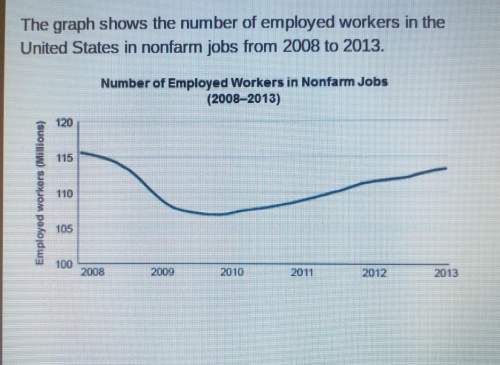
The graph shows the number of employed workers in the
united states in nonfarm jobs from 2008 t...

Mathematics, 16.10.2019 16:30, dionne83
The graph shows the number of employed workers in the
united states in nonfarm jobs from 2008 to 2013.
the best conclusion that can be drawn from the graph is that
the number of nonfarm jobs
remained consistent over time.
started going down in 2008.
went up every year since 2008
started going down in 2010.

Answers: 1
Other questions on the subject: Mathematics
Mathematics, 22.06.2019 01:20, dominikbatt
Which of the following shows the graph of y=2e^x?
Answers: 2
Mathematics, 22.06.2019 03:00, bradenjesmt1028
The accompanying data represent the miles per gallon of a random sample of cars with a three-cylinder, 1.0 liter engine. (a) compute the z-score corresponding to the individual who obtained 42.342.3 miles per gallon. interpret this result.
Answers: 3
Do you know the correct answer?
Questions in other subjects:
Mathematics, 01.06.2021 14:00

Business, 01.06.2021 14:00
Mathematics, 01.06.2021 14:00
Mathematics, 01.06.2021 14:00

Arts, 01.06.2021 14:00
Mathematics, 01.06.2021 14:00

English, 01.06.2021 14:00


