


Brainliest for the correct answer and 5 full stars
eric plotted the graph below to show the re...

Mathematics, 23.09.2019 06:00, jnannsbwnw4216
Brainliest for the correct answer and 5 full stars
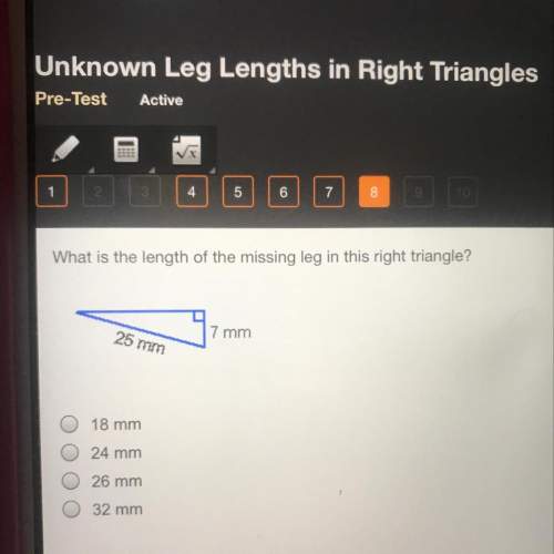
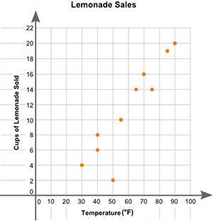
eric plotted the graph below to show the relationship between the temperature of his city and the number of cups of lemonade he sold daily:
a scatter plot is shown with the title lemonade sales. the x-axis is labeled high temperature, and the y-axis is labeled cups of lemonade sold. data points are located at 30 and 4, 40 and 6, 40 and 8, 50 and 2, 55 and 10, 65 and 14, 70 and 16, 75 and 14, 85 and 19, 90 and 20.
part a: describe the relationship between the temperature of the city and the number of cups of lemonade sold.
part b: describe how you can make the line of best fit. write the approximate slope and y-intercept of the line of best fit. show your work, including the points that you use to calculate the slope and y-intercept.

Answers: 2
Other questions on the subject: Mathematics
Mathematics, 21.06.2019 12:30, giulianna41
Which of the following could be the graph of the equation y = -2x + 5
Answers: 2
Mathematics, 21.06.2019 19:30, johndiaz26
Solve the following inequalities and show the solution on a number line. 2x+3< 3(4x+5)
Answers: 1
Do you know the correct answer?
Questions in other subjects:


Advanced Placement (AP), 29.09.2019 10:10
Mathematics, 29.09.2019 10:10
Mathematics, 29.09.2019 10:10

Biology, 29.09.2019 10:10


